|
Step through a life
|
Inspiration:
|
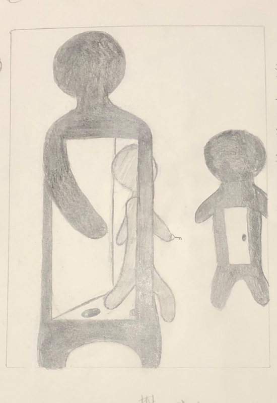
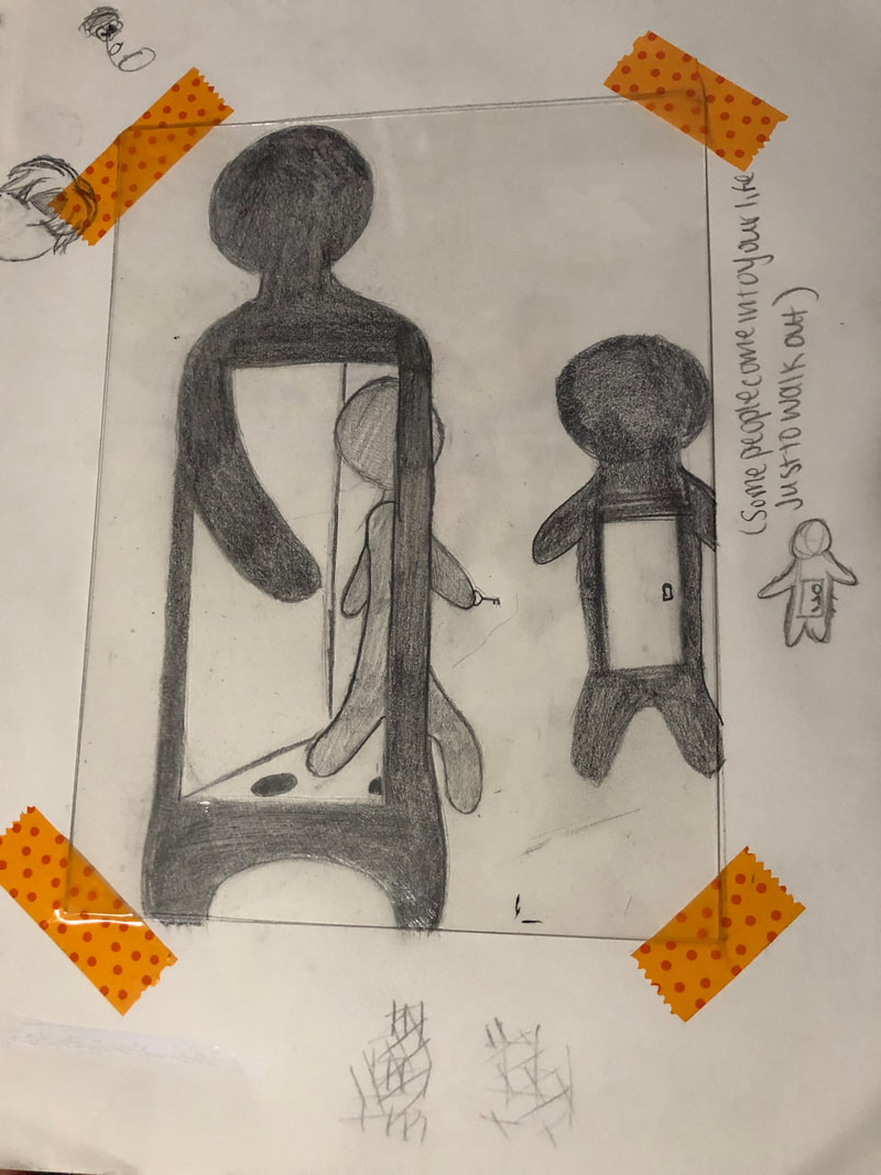
The piece that inspired me was Pop shop 1. What inspired me about the piece was how the figures looked and worked. The figures look as if they are three humans and two are giving each other high fives through the figure in the center possibly symbolizing how even though they really are there it feels as if they weren't because everything that happens only goes through them and into the other. This was the way I first interpreted the piece and I decided to depict one figure walking through someone to get to the other figure whose door is locked although they have the key to their door as well. The key and the door resembles how sometimes people make a difference in your life by just being there and when they leave they might go to someone else and use the same key they used on you to open their door so that they can do the same thing over and over again, an endless cycle.
|
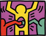
“Keith Haring, Pop Shop 1, 1987.” Rhodes Contemporary Art, https://rhodescontemporaryart.com/artists/170-keith-haring/works/3299-keith-haring-pop-shop-1-1987/.
“Pop Shop.” Pop Shop | Keith Haring, http://www.haring.com/!/pop-shop.
|
Planning:
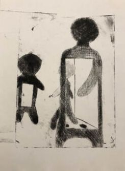
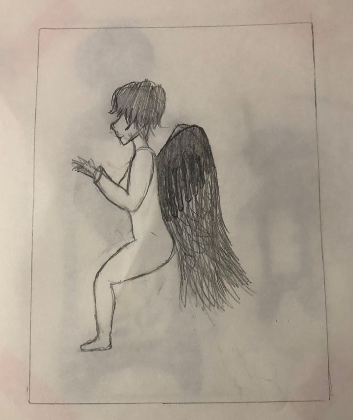
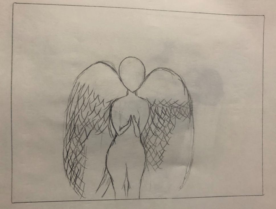
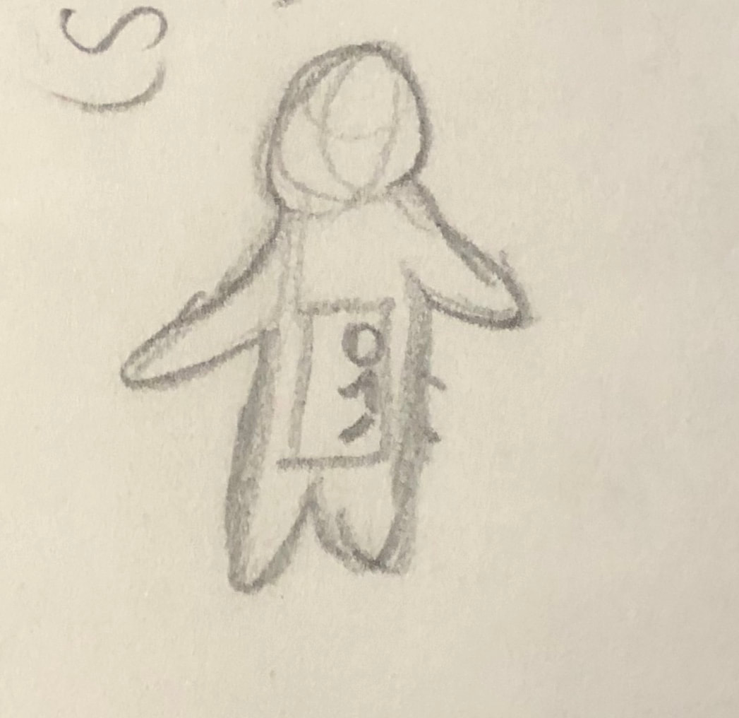
In this stage I had a hard time especially since in the beginning I did not know what I wanted to make. As a result I tried to do some research and what first caught my eyes were some famous paintings of angels so in the beginning I drew a sitting angel with black wings but I wanted to elaborate more on that. Then I decided to make an Angel that faces the front view with the wings out and towards each side of the figure. Then what I liked most about the drawing was the figure in the center so I then made a figure on accident since I was frustrated because I was not drawing it the way I imagined it. After, I drew another person in the center which gave me the idea of making a gap within the person that is big enough for something to walk through. Eventually, it got me thinking so I looked up pop art like figures and one of the results were one of Keith Harings posters that looked similar. I then found my inspiration piece while looking through his art works it then showed what I wanted to show a figure going through another figure.
In this stage I had a hard time especially since in the beginning I did not know what I wanted to make. As a result I tried to do some research and what first caught my eyes were some famous paintings of angels so in the beginning I drew a sitting angel with black wings but I wanted to elaborate more on that. Then I decided to make an Angel that faces the front view with the wings out and towards each side of the figure. Then what I liked most about the drawing was the figure in the center so I then made a figure on accident since I was frustrated because I was not drawing it the way I imagined it. After, I drew another person in the center which gave me the idea of making a gap within the person that is big enough for something to walk through. Eventually, it got me thinking so I looked up pop art like figures and one of the results were one of Keith Harings posters that looked similar. I then found my inspiration piece while looking through his art works it then showed what I wanted to show a figure going through another figure.
|
|
|
|
Process:
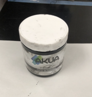
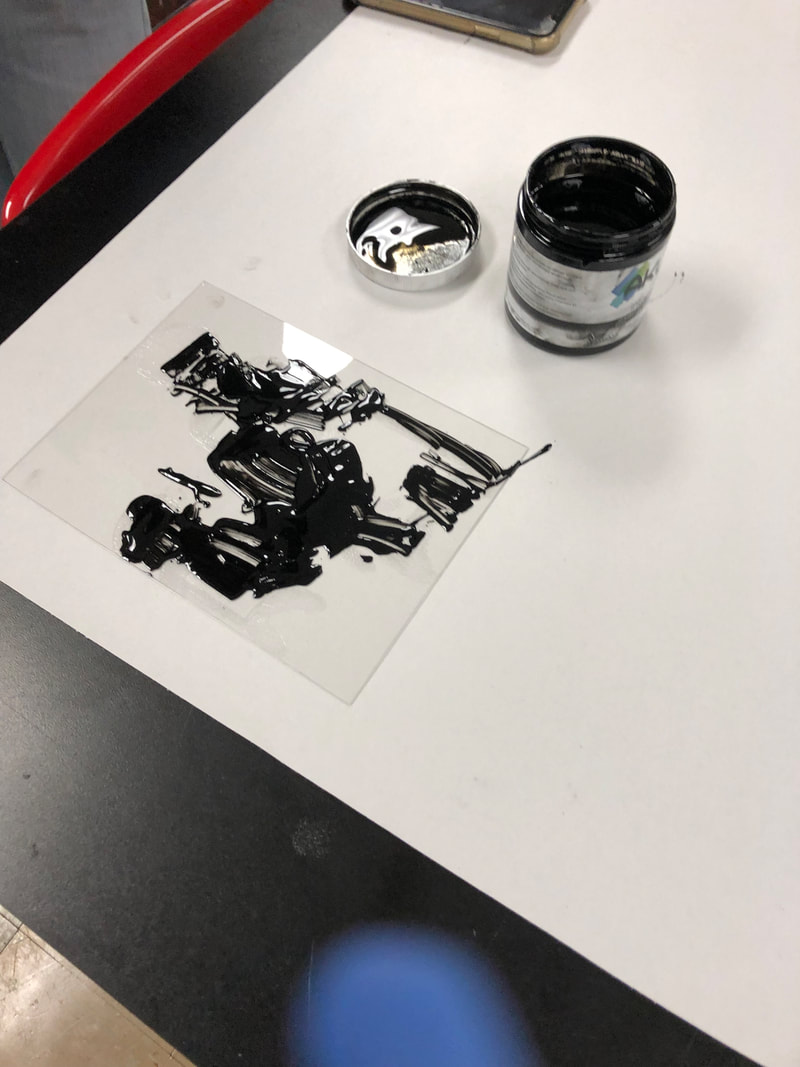
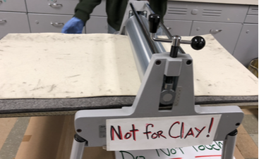
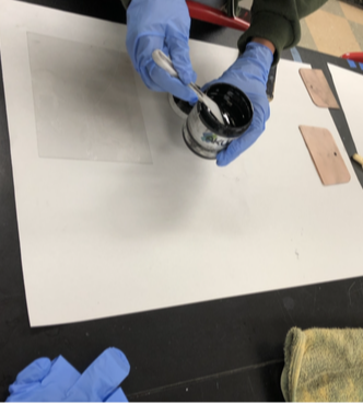
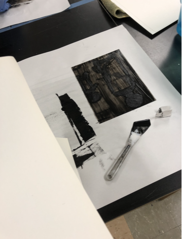
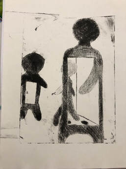
I started this project in the month of October and finished it within the month as well. In this project I started off by opening up my sketchbook and drawing things that I thought I might want to incorporate into my piece. For example some of the things I wanted to incorporate were angel wings on a person I believe that was mostly influenced by the songs I was listening to at the time which had many wing references. Then I began to look up angels and wanted to do a piece that would look dreary and be a bit complex in the sense that it would have a lot going on. Eventually I decided that I didn't want to draw wings because I didn't like how they turned out and then I accidentally drew something that reminded me of a certain piece but since I could not find it I found one that was similar that influenced me even more. After I finished drawing I placed my plastic dry point sheet on top of it and I started etching in all the areas I shaded in with my scribe tool. The technique I used for this piece was cross hatching I used cross hatching to create dark and light toned areas in my piece. Then When I finished etching I went to the back and gathered all my materials to start the inking process. Before I started inking though I had to grab some water color paper and soak it for 7 and a half minutes in water. The type of ink I used for this project was Akua in the color intaglio i used gloves while using the ink because if not it would have been very difficult to get off of my hands so I learned. I grabbed some ink using a palette knife and began to cover the areas I wanted ink then I used a scraper tool and scrapped the ink into the cross hatches. When I finished putting the ink into the cross hatched I grabbed paper and rubbed the areas I did not want ink on so that it could remove the ink. Then when I was done the paper had soaked for enough time so I placed it onto a towel so it could soak up all the access water on it. After I grabbed the paper put it under the roller and placed my plastic with ink on top of the paper face down then I put the fabric on the roller back on top of the piece then I span the wheel over my piece and took it out. When I took it out I then peeled the paper off of the plastic and then let my piece dry. |
|
Experimentation:
|
During this project I had a lot of mistakes. In the beginning when I was assigned the project I didn't think it would be as hard as it was for me as it was. One of the thinks I noticed during the inking process was that if you do not use glove your hands will be stained for the whole day. I also noticed that when wiping the plastic sheet you should go in circle because it takes the ink off more efficiently. Also when putting ink I learned that I shouldnt put a lot since the ink is going to get taken off mostly either way. I experimented with lighter and darker shades while drawing and cross hatching it was a bit different than I originally thought but it was still nice.
|
|
|
Reflection:
During this project I found it typically harder to time manage but as the piece came along it got better bit by bit. I originally thought I was going to make a piece that was angel related which was more difficult than I thought. Another reason I ddi not do an angel was because it did not fit with in my theme relationships of people. I think that there are many things I can do better in my next project for example I could time manage better, create a better visual, and use more elements and principles of art. Time management is especially important when creating an art piece especially when you have a certain amount of time to get it done. A better visual would have been nice too so that I could use more symbolism and it could look more appealing.
- Compare and contrast
Pop shop 1 and my piece Step through life have many similarities and differences. Like pop shop 1 my piece shows a figure going through another figure. This symbolized how in many cases people enter you life just to leave a mark and leave and there is nothing you can do to stop them which is why the middle figure has a key showing that not even a locked door can stop them they can find a way. Pop shop 1 was created along with the other pop shop to show how all people no matter the race, religion, wealth, or personality should be able to go and view art work and not always in a gallery environment. Keith Haring used silk screen to create his piece while piece is a dry point these two are very similar but also different processes. Pop shop 1 unlike Step though life has lots of different colors. I used cross hatching in my piece to create shadows and different toned people. The piece pop shop 1 is almost symmetrical looking and my piece is very much asymmetrical.
|
|
|
ACT questions
Clearly explain how you are able to identify the cause effect relationship between your inspiration and its affect on your artwork?
- Pop shop 1 inspired me to make a piece in which a person came and walked through someone else. This effected my artwork because from experience I know how it feels to have people walking in and out of my life.
What is the overall approach of the author has regarding the topic of your inspiration?
- Keith Haring made pop shop 1 and all the other pop shops to make it more reachable for the people. He didn't want the
What kind of generalizations and conclusions have you discovered about people, ideas, cultures, etc. while you researched your inspiration?
- I have concluded that Keith Haring wanted an environment where anyone could go inside and see his artworks not just art critics or people who had more money then average people.
What was the central idea or theme around your inspirational research?
- The central idea for my piece was to show how people can walk into your life just to walk out of it. This was meant to show the relationship some people have and lose even though they may not want to lose them people grow apart.
What kind of inferences (conclusions reached on the basis if evidence and reasoning) did you make while reading your research?
- I reached the conclusion that pop shop 1 was made so that people who cannot afford going to distinguished galleries all the time could go some where else to see the art of Keith Haring without the pressures of the environments.
Bibliography
“Keith Haring, Pop Shop 1, 1987.” Rhodes Contemporary Art, https://rhodescontemporaryart.com/artists/170-keith-haring/works/3299-keith-haring-pop-shop-1-1987/.
“Pop Shop.” Pop Shop | Keith Haring, http://www.haring.com/!/pop-shop.
“Keith Haring, Pop Shop 1, 1987.” Rhodes Contemporary Art, https://rhodescontemporaryart.com/artists/170-keith-haring/works/3299-keith-haring-pop-shop-1-1987/.
“Pop Shop.” Pop Shop | Keith Haring, http://www.haring.com/!/pop-shop.
