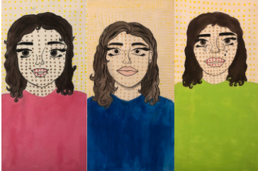
Triptych
|
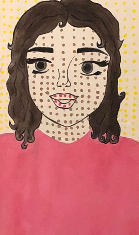
My pov of things
61 cm x 30 cm (3) Triptych Exhibition text: These combination pieces are made to tell the story of my point of view on the relationship of me and my best friend. These pieces are self portraits representing different emotions based off of what me and my best friend go through. |
Inspiration:

"I don't care! I'd rather sink — than call Brad for help!" laments Lichtenstein's 1963 Drowning Girl.
The Museum of Modern Art, New York/Estate of Roy Lichtenstein |
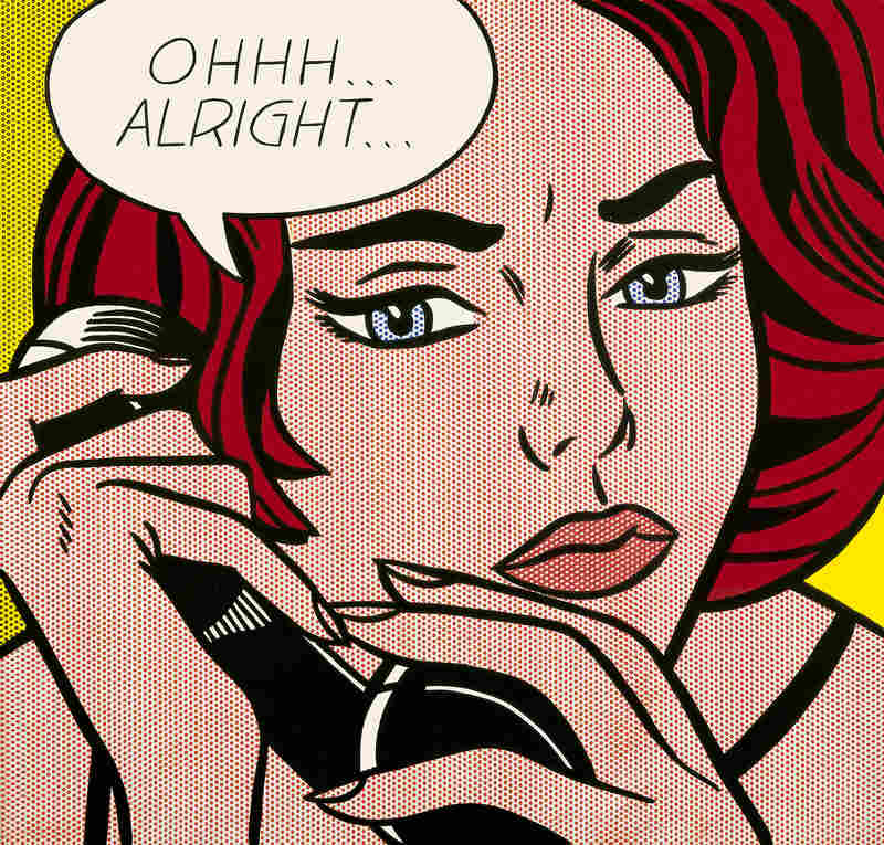
Roy Lichtenstein leaves it up to the viewers to decide what has just transpired in his 1964 painting of a tense phone call titled Ohhh ... Alright ...
Estate of Roy Lichtenstein |
These were the pieces that inspired me to do a pop art style story board. What inspired me about the piece was the strong looking feminine figures in Lichtenstein's pieces. For these pieces I wanted to show my interpretation of myself, I think that I am a strong female figure. What I wanted to incorporate into my pieces that Lichtenstein's work shows is the emotion of things just by looking at the piece. So I decided a large view of me and bold expressions would be the best way to go with this piece. I wanted to put me into the pieces rather than make material things represent me. I was also inspired by the obvious connection to a story that Lichtenstein's pieces have. For example when you see the piece "I don't care! I'd rather sink — than call Brad for help!" the first thing I think of is a very strong independent woman maybe even a feminist who wants to doesn't want to depend on a man to come to her rescue.
Planning & process:
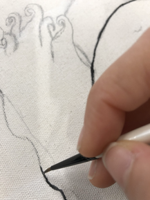
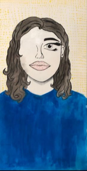
To start out my piece I sat down and planned out what I wanted to do for all my pieces. I knew that they were all supposed to have a certain topic for each. Them being "You, how you affect the situation, and how the situation affects you" keeping this in mind I started to come up with concepts. I decided that I wanted the problem to be about my relationship with my best friend. Our friendship was what sparked the thought of making the project about it. During the summer we would talk all the time and everyday since I could never see him he goes to another school. For the first one I decided I'd start with my perception of me. I began by sketching myself on the canvas in a way that looked like a pop art. Then I started to paint the black outline on my hair and I started to incorporate some black line work in the hair. Then I did the black line work on the rest of me such as the shirt and my face. After that I grabbed the color yellow and started to make a dotted background using a fine tipped paint brush, a bobby pin, and a q tip. I then decided to take a mixture of all the primary colors red, blue, and yellow to make a brown for the hair and eyes. I then mixed s little bit of water with the acrylic and colored all of the hair. Then I colored in the shirt blue to represent how I felt at the moment. I took the interpretation of sadness and the color blue and decided the shirt would represent the emotion I felt and the yellow background would represent what I am usually. I decided that the yellow background would convey happiness or cheerfulness since yellow is considered to be the color of sunshine. Lastly pick would convey hidden upsetness, red is typically considered to be used when people are angry so i took the red and mixed it with good intentions aka white. The white is meant to hide the fact that I am upset about not being able to see my best friend but I will not show it because its whats best to do in the situation. Lastly, I grabbed a light green in order to represent a slight envy, envy of those who are still around in their life while I can't be.
To start out my piece I sat down and planned out what I wanted to do for all my pieces. I knew that they were all supposed to have a certain topic for each. Them being "You, how you affect the situation, and how the situation affects you" keeping this in mind I started to come up with concepts. I decided that I wanted the problem to be about my relationship with my best friend. Our friendship was what sparked the thought of making the project about it. During the summer we would talk all the time and everyday since I could never see him he goes to another school. For the first one I decided I'd start with my perception of me. I began by sketching myself on the canvas in a way that looked like a pop art. Then I started to paint the black outline on my hair and I started to incorporate some black line work in the hair. Then I did the black line work on the rest of me such as the shirt and my face. After that I grabbed the color yellow and started to make a dotted background using a fine tipped paint brush, a bobby pin, and a q tip. I then decided to take a mixture of all the primary colors red, blue, and yellow to make a brown for the hair and eyes. I then mixed s little bit of water with the acrylic and colored all of the hair. Then I colored in the shirt blue to represent how I felt at the moment. I took the interpretation of sadness and the color blue and decided the shirt would represent the emotion I felt and the yellow background would represent what I am usually. I decided that the yellow background would convey happiness or cheerfulness since yellow is considered to be the color of sunshine. Lastly pick would convey hidden upsetness, red is typically considered to be used when people are angry so i took the red and mixed it with good intentions aka white. The white is meant to hide the fact that I am upset about not being able to see my best friend but I will not show it because its whats best to do in the situation. Lastly, I grabbed a light green in order to represent a slight envy, envy of those who are still around in their life while I can't be.
|
|
|
Experimentation:
During this process there were a lot of things I had trouble on and had to try to improve. I think one of the most difficult tasks I had to do during this project was try to keep the colors evenly placed, especially on larger areas such as the shirts. Originally i planned to use a bobby pin to make the dots but after trying a few in a row I realized they were too small and did not bring the piece together. I then decided to go and get some q-tips and try the q-tips they were a much better size so i continued with those throughout the piece.
During this process there were a lot of things I had trouble on and had to try to improve. I think one of the most difficult tasks I had to do during this project was try to keep the colors evenly placed, especially on larger areas such as the shirts. Originally i planned to use a bobby pin to make the dots but after trying a few in a row I realized they were too small and did not bring the piece together. I then decided to go and get some q-tips and try the q-tips they were a much better size so i continued with those throughout the piece.
Reflection:
My art project "My pov of things" is a representation of my relationship with my best friend. Personally I feel like pop art was a good way to display my intentions in the piece. Originally I wanted to use another artist but then I came across Roy Lichtenstein's pieces and felt more inspired by them. After finishing this project I know that there are many areas I need to improve on and that I have to practice doing better on. I think some of them would be my technique but also the way I get my inspiration. I think rather than randomly getting inspired which can take some time I much rather research a few artists intentions behind their works to find similarities and try to relate to them on a different skill level.
My art project "My pov of things" is a representation of my relationship with my best friend. Personally I feel like pop art was a good way to display my intentions in the piece. Originally I wanted to use another artist but then I came across Roy Lichtenstein's pieces and felt more inspired by them. After finishing this project I know that there are many areas I need to improve on and that I have to practice doing better on. I think some of them would be my technique but also the way I get my inspiration. I think rather than randomly getting inspired which can take some time I much rather research a few artists intentions behind their works to find similarities and try to relate to them on a different skill level.
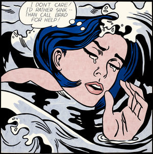
"I don't care! I'd rather sink — than call Brad for help!" laments Lichtenstein's 1963 Drowning Girl.
|
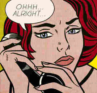
Roy Lichtenstein leaves it up to the viewers to decide what has just transpired in his 1964 painting of a tense phone call titled Ohhh ... Alright ..
|
ACT questions
Clearly explain how you are able to identify the cause effect relationship between your inspiration and its affect on your artwork?
-
What is the overall approach of the author has regarding the topic of your inspiration?
-
What kind of generalizations and conclusions have you discovered about people, ideas, cultures, etc. while you researched your inspiration?
-
What was the central idea or theme around your inspirational research?
-
What kind of inferences (conclusions reached on the basis of evidence and reasoning) did you make while reading your research?
-I reached the conclusion that Lichtenstein's pieces are all examples of woman with exaggerated expressions to a certain situation affecting them.
Bibliography:
Stamberg, Susan. “One Dot At A Time, Lichtenstein Made Art Pop.” NPR, NPR, 15 Oct. 2012, https://www.npr.org/2012/10/15/162807890/one-dot-at-a-time-lichtenstein-made-art-pop.
Stamberg, Susan. “One Dot At A Time, Lichtenstein Made Art Pop.” NPR, NPR, 15 Oct. 2012, https://www.npr.org/2012/10/15/162807890/one-dot-at-a-time-lichtenstein-made-art-pop.
